Simplifying daily health tracking for chronic-care patients
101%
Adoption Rate
5x
Engagement


Prologue
Credo Health is an Indian startup partnering with Apollo, Kauvery, and Manipal Hospitals. We provide a unified chronic-care platform that acts as a daily health diary for patients and a remote monitoring and database tool for doctors.
As a founding designer at the agile startup, I owned the end-to-end process for Credo: from SME research and problem framing to UI/UX design and delivery.
Patients log daily health data
+
Doctors get structured insights
=
Better Care
& Outcomes
Problem space
Problem
Patients weren’t using it.
The first version of the Credo app struggled to gain adoption. Patients found it confusing, difficult to navigate, and inaccessible, leading to very low engagement despite strong clinical value.
And when they didn’t log in the app…They texted everything on WhatsApp,
Which meant coaches manually tracked data.
Which meant structured insights broke down.
Which meant the product wasn’t scaling.
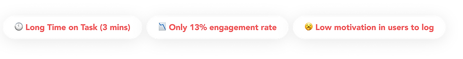
The affected KPIs were
How do we make daily logging feel effortless, not clinical?

UI created by Doctors (SMEs) & Devs
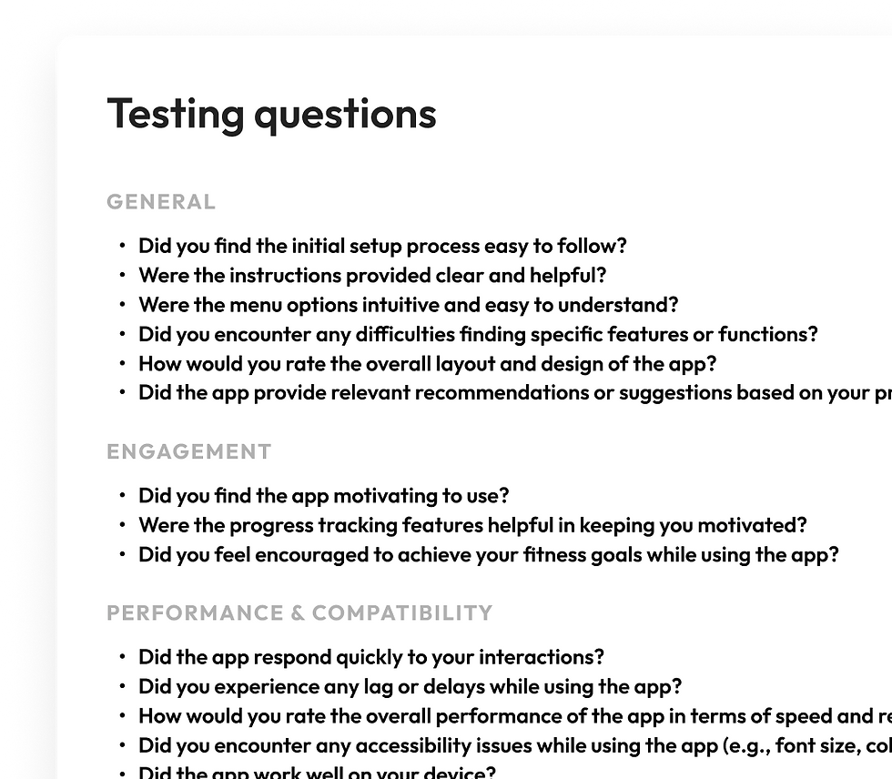
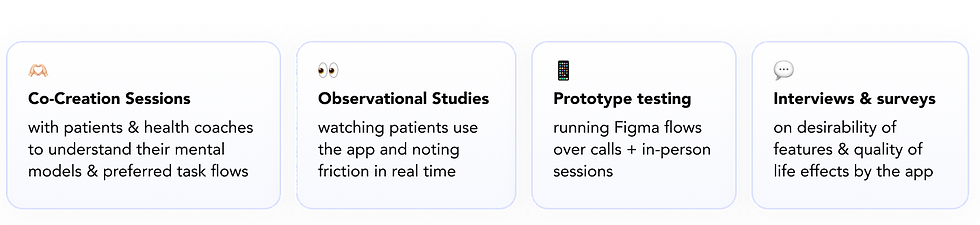
Research (with zero fancy tools)
We had no Hotjar. No Maze. No heatmaps.
So we got scrappy.

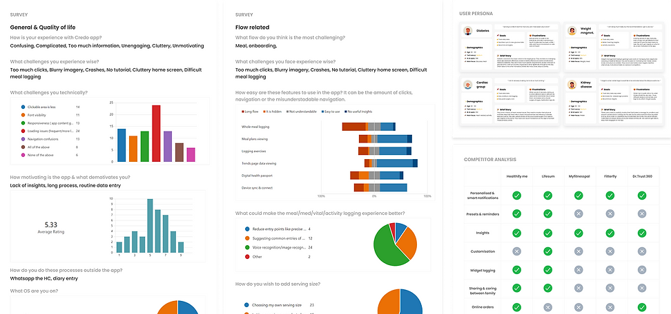

And from the research, the findings were
Biggest insight?
👎🏻
Patients don't want numbers
Not '20g Carbs'
👍🏻
They want answers.
But 'Your lunch carbs are higher than usual.'
Also, typing everything daily is demotivating. If it’s even slightly confusing, they’ll switch to WhatsApp.
Reframing the goal. The Solution
After analysing behavioural data, frustration patterns, and usability gaps, I understood,
We weren’t building a tracker. We were building a daily companion.
Design System Updation
A New Design Language for a Wide Age Spectrum
Users ranged from 20 to 60 years. So I rebuilt the interface to be:
-
High contrast
-
Larger tap targets
-
Under 5-click flows
-
Progressive disclosure
-
Language-scalable (5+ regional languages)
We reduced visual noise and increased clarity. The UI finally felt calm.
Old UI developed by doctors & PMs 👆🏻

My updates post research
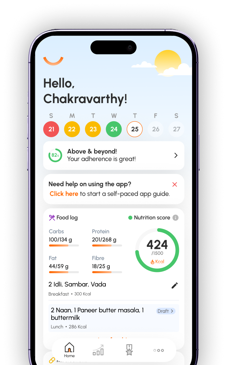
The old home screen showed long graphs and low-value indicators.
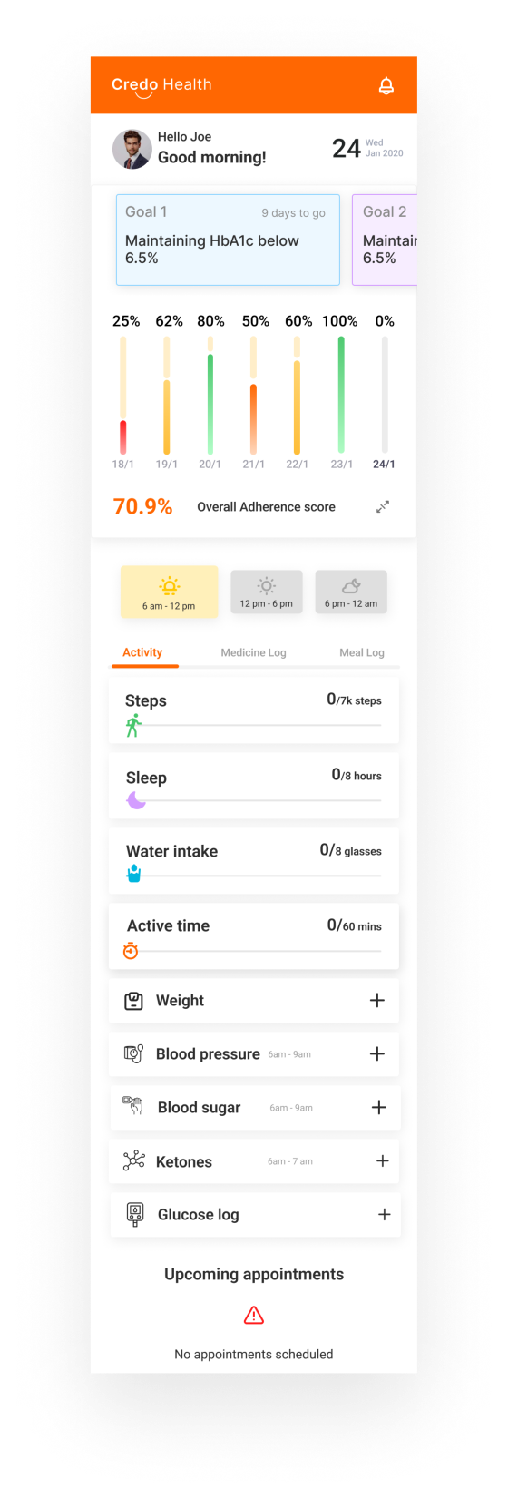
Home Page Redesign
Rebuilt the Home Around Daily Action
Home became action-first, not data-first,
and user-friendly

Graph reduced to little indicators with colors
App guide starter
Meal tracker with goals upfront
One click medicine & water logs


Backend + System Fixes
which contributed to bigger problems in database and operational efficiency

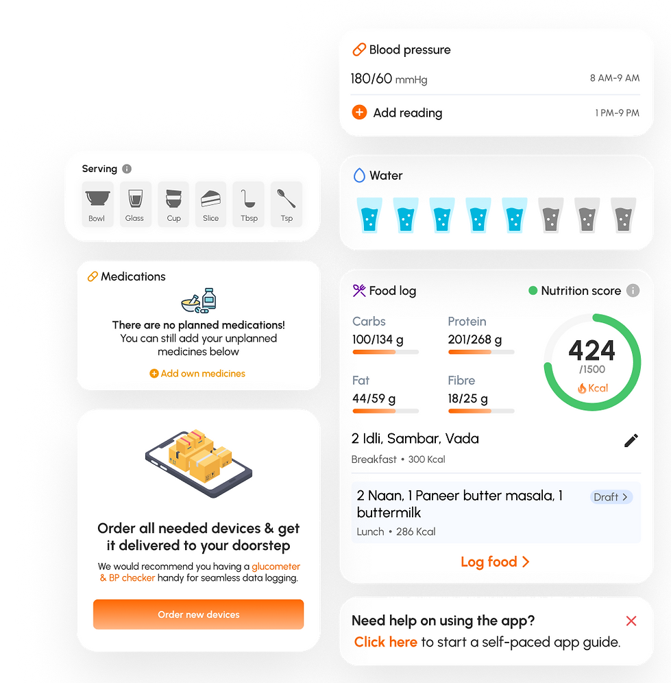
Some Thoughtful Additions
to make logging easier for everyone


BP schedule is already available to avoid guessing reading times & one click water logging
Visual cues of serving size according to Indian household measurements instead of grams


Medicine Logs if any avalable in home page
Nutritional info in home page with clear progress & logs
Did It Work?
After multiple iterations and beta testing:
101%
Adoption Rate
5x
Engagement
900%
Enrollment
Beyond Metrics:
💛 Patients had better insights to act on & controlled their health issues.
👩🏻⚕️ Doctors & internal team had better structured data to work with & train AI models
💰 We signed contracts with 4 new hospitals from India & US