

Simplifying daily health tracking for chronic-care patients
66%
Time-On-Task
5x
Engagement
Prologue
Credo Health is a healthcare startup partnering with leading doctors from Apollo Hospitals, Kauvery Hospitals, and Manipal Hospitals in India. We built a unified chronic-care app that acts as a daily health diary and e-care companion for patients, while serving as a patient database, remote monitoring system, and nursing assistant for doctors.
As the founding designer in a fast-paced startup, I led the end-to-end design process, from research, problem framing, and ideation with SMEs, to UX/UI design, testing, and delivery of the entire Credo app experience.
🙎🏼♀️ Users were patients with chronic conditions like diabetes, hypertension, kidney disease etc.
☹️ Problem Space
The first version of the Credo app struggled to gain adoption. Patients found it confusing, difficult to navigate, and inaccessible, leading to very low engagement despite strong clinical value. So users 'texted' their daily meal, meds and activity logs via Whatsapp, which became a huge work for health coaches to keep track of.
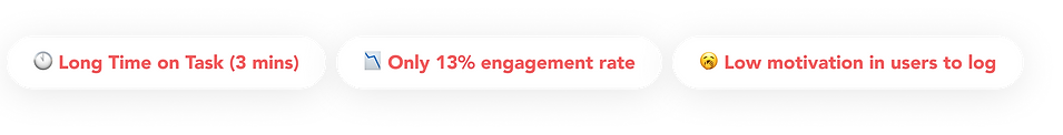
The affected KPIs were
Designing for vernacularity and for a wide age range of 20-60 years were our key constraints
How can we make users quickly log daily health data 'in the app', without feeling confused & overwhelmed, so that doctors and health coaches have data to help the patients with?
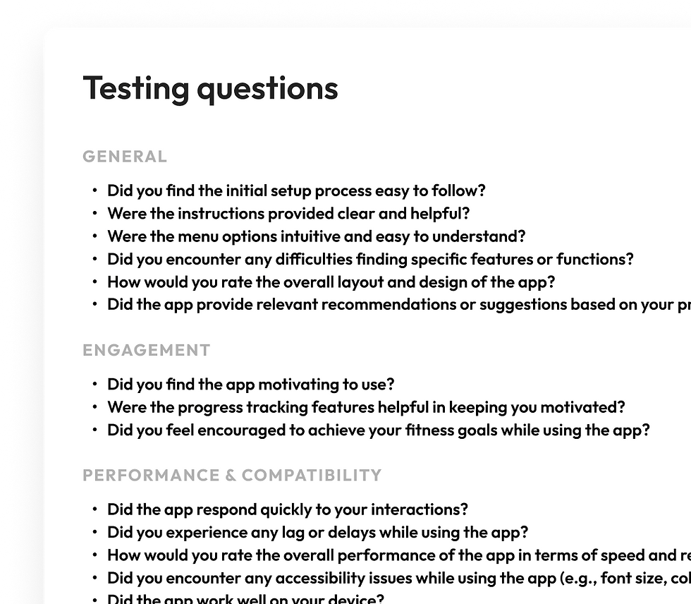
🔎 Research Planning
🥲 We had zero budget for UX research tools. No Hotjar, no heatmaps, no session replay, no Maze/Useberry, no automated user-testing stack.
So instead of relying on tool-heavy research, we went forward with
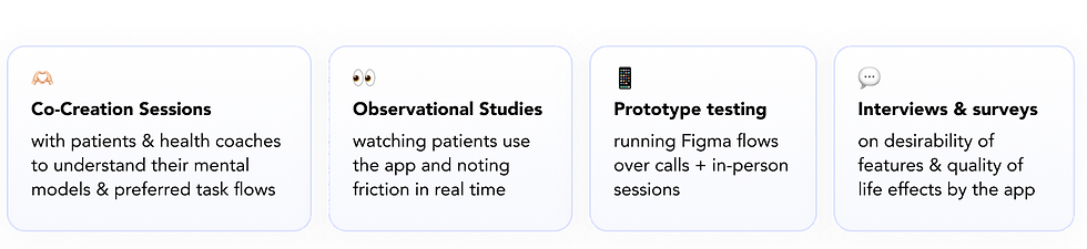
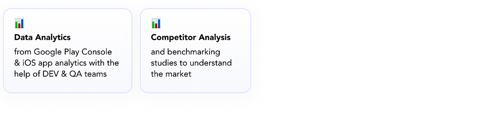
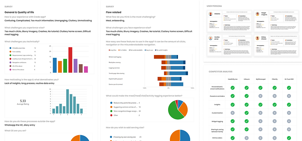

And from the research, the findings were
👤 User Goals
Log daily health data quickly & without fatigue.
Users don’t want raw numbers. They want answers like - Your lunch carbs are high vs your usual.
Feel Credo app as a companion rather than using it as a notes taker.
💼 Business Goals
Improve user retention & daily active usage (DAU)
Generate high-quality structured patient data for EHR
Boost engagement with AI-driven recommendations
Reduce drop-off rates in key flows (like meal logging)
Enable AI model training that powers future product lines
✅ The Solution
After analysing behavioural data, frustration patterns, and usability gaps, I redesigned the Credo app end-to-end to make daily health logging simpler, faster, and more motivating for patients with chronic conditions.
1️⃣ A New Design Language that also suits Vernacular Needs
I rebuilt the interface with a calmer, more readable visual system optimised for a wide age spectrum (20–60 years).
Key changes included:
-
Larger tap targets
-
High-contrast icons
-
Flows under 5 clicks
-
Progressive disclosure
-
UI scalable for multiple languages

Old UI developed by doctors & PMs 👆🏻

Our updates post research 👇🏻
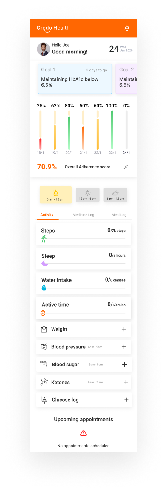
Before
Long graphs, low-value data, tiny tap areas, sliders that didn’t capture real inputs.
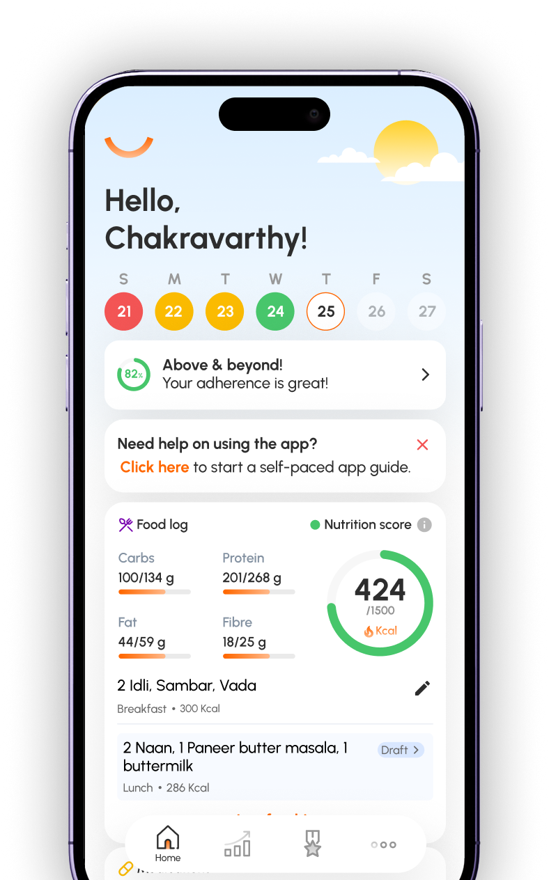
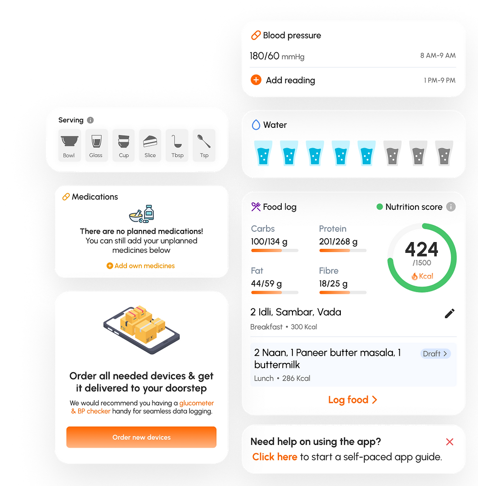
2️⃣ A Reset of the Home Page: Designed Around Daily Logging
The home page drove most daily actions, so I restructured it based on real user priorities.
Graph reduced to little indicators with colors
App guide starter
Meal tracker with goals upfront
One click medicine & water logs
After
Better main space for important daily logs, one click loggings, better clickable areas

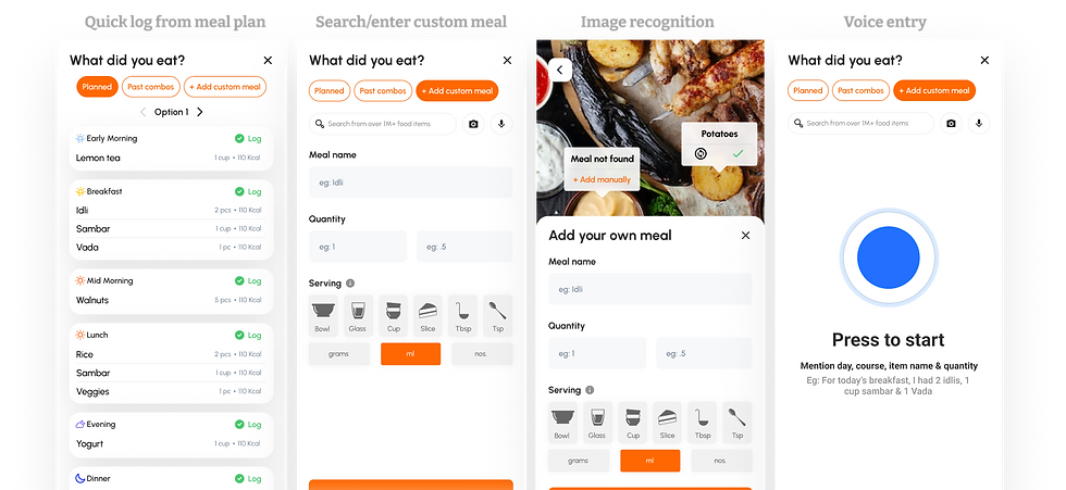
3️⃣ A Smarter, Shorter Meal Logging Flow
Meal logging was the most exhausting flow with maximum drop-offs.

We brought it down from


Select course > Search meal item > Enter serving size eaten > Select date & time (repeat everything for every food item per course)
Old UI developed by doctors & PMs 👆🏻
Our updates post research (with AI features like Image recgonition & voice input) 👇🏻
One click log from the meal plan / Add custom meal with visual cues for serving size / AI image recognition / Talk to AI to log meal (according to shown script)
& a few other issues were encountered
which contributed to bigger problems in database and operational efficiency

🧪 Did we solve the problem?
After multiple iterations, co-creation sessions, and a continuous feedback loop, we launched a beta release of the redesigned Credo app.
Our goals were clear: Reduce TAT, higher engagement, lower drop-offs, increased motivation, more reliable experience.
✨ And the results surpassed expectations.
66%
Time-On-Task
5x
Engagement
900%
Enrollment
Not just that,
💛 Users had better insights to act on & controlled their health issues.
👩🏻⚕️ Doctors & internal team had better data to work with & train AI models
💰 We signed contracts with 4 new hospitals from India & US
